Editor cards
Cards add everything that isn’t plain text to a post: images, buttons, callouts, toggles, signup forms, embeds and more.
Who can do this: Anyone on your staff who can write posts.
A card is a block in your post that does one thing: shows an image, adds a button, hides an answer behind a toggle, asks readers to subscribe. You add cards the same way every time, and each card has its own small set of options.
Add a card
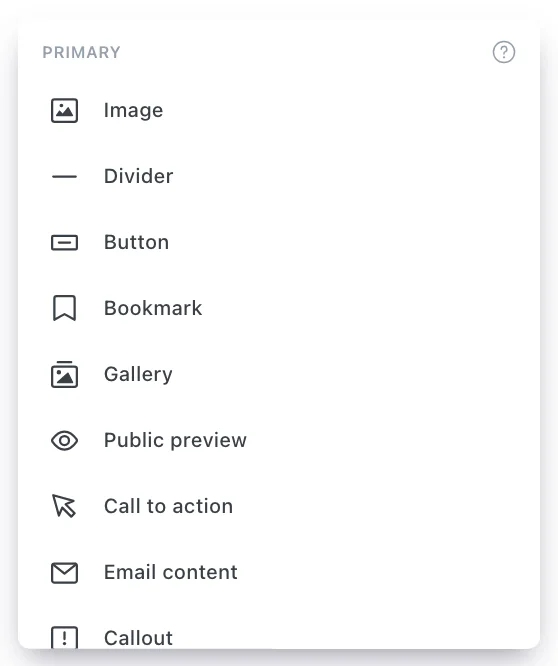
There are two ways to open the card menu. Both work on an empty line.
- The + button. Click into an empty line and select the + that appears in the left margin. Scroll the menu, then select a card.
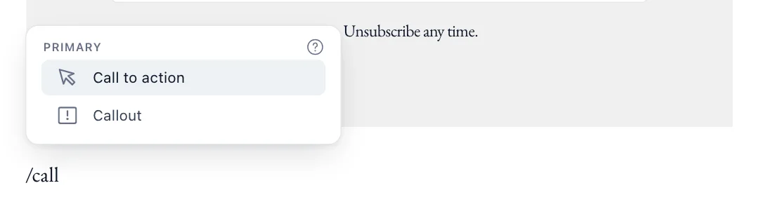
- A slash. Type
/and start typing the card’s name. The menu narrows as you type; press Enter to insert the highlighted card. Some cards take a link straight away, for example/youtube https://…or/bookmark https://….
Edit, move and remove a card
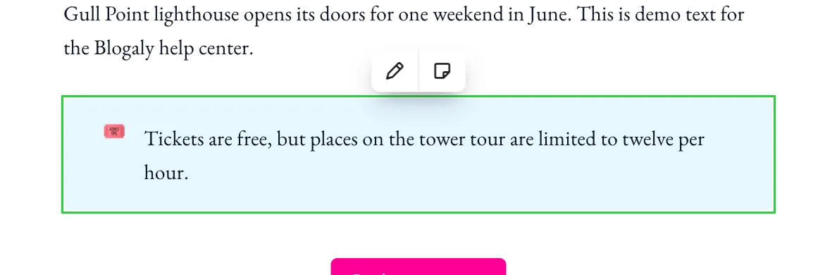
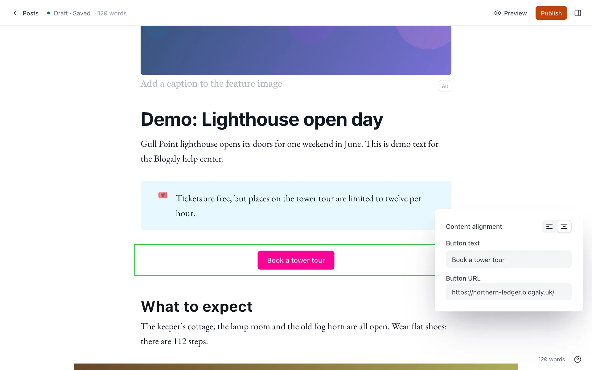
- Click a card once to select it. A green outline and a small toolbar appear. The toolbar’s buttons depend on the card: most have Edit (the pencil) and Save as snippet.
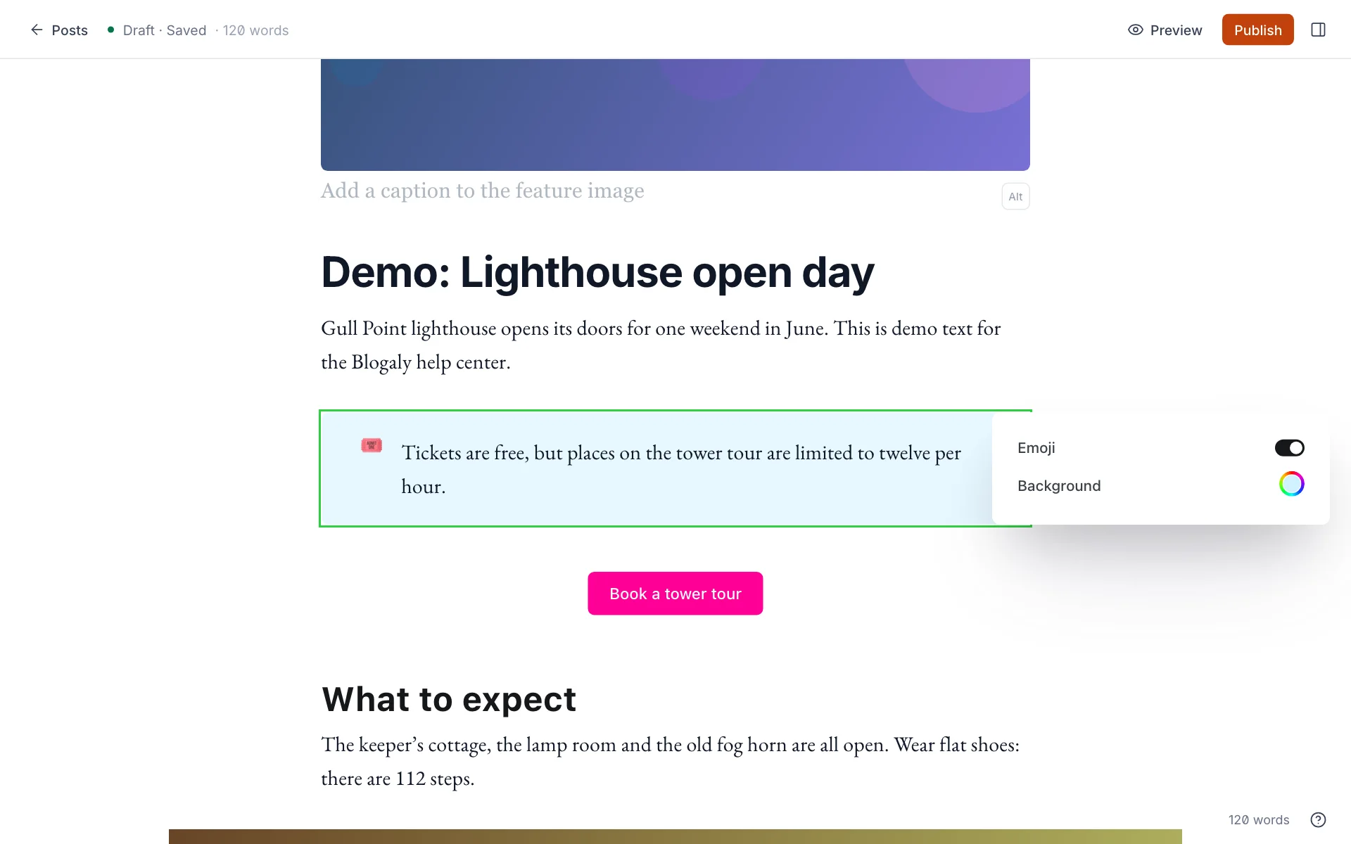
- Select Edit, double-click the card, or press Cmd+Enter (Mac) / Ctrl+Enter (Windows) to change its content and settings. A settings panel opens beside the card.
- Click anywhere outside the card, or press Escape, when you’re done.
- Move a card: drag it by its edge to a new place in the post.
- Remove a card: select it and press Backspace or Delete. Cmd+Z / Ctrl+Z undoes it.
- Reuse a card: save it as a snippet and insert it into any post.
Every card, and what it’s for
| Card | What it does | Slash command |
|---|---|---|
| Image | One image, with a caption, alt text and an optional link. Three widths. See images and media. | /image |
| Divider | A horizontal line between sections. Typing --- on a new line does the same. | /hr |
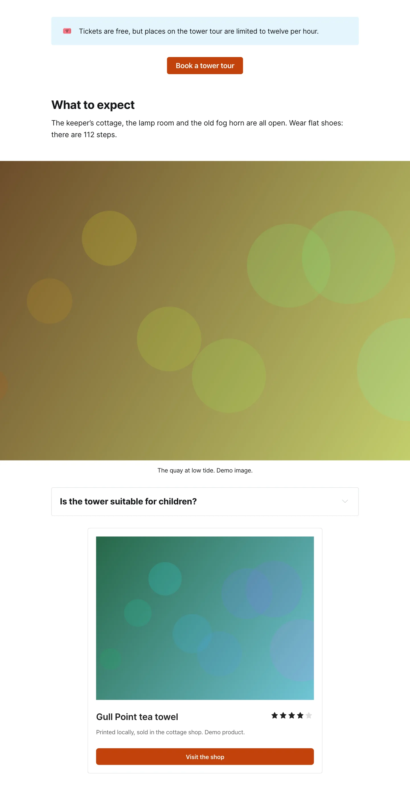
| Button | A single button that links anywhere. Set the text, the link and left or centre alignment. | /button |
| Bookmark | A link shown as a preview box, with the page’s title, description and image. | /bookmark |
| Gallery | Up to nine images in a tidy grid. | /gallery |
| Public preview | A line that splits a members-only post into a free preview and the rest. See who can read a post. | /paywall |
| Call to action | A highlighted box with text, an optional image and a button, for sponsors and announcements. | /call to action |
| Email content | Text that only appears in the email version of a post, never on your site. | /email |
| Callout | A coloured box with an emoji, for tips and warnings. | /callout |
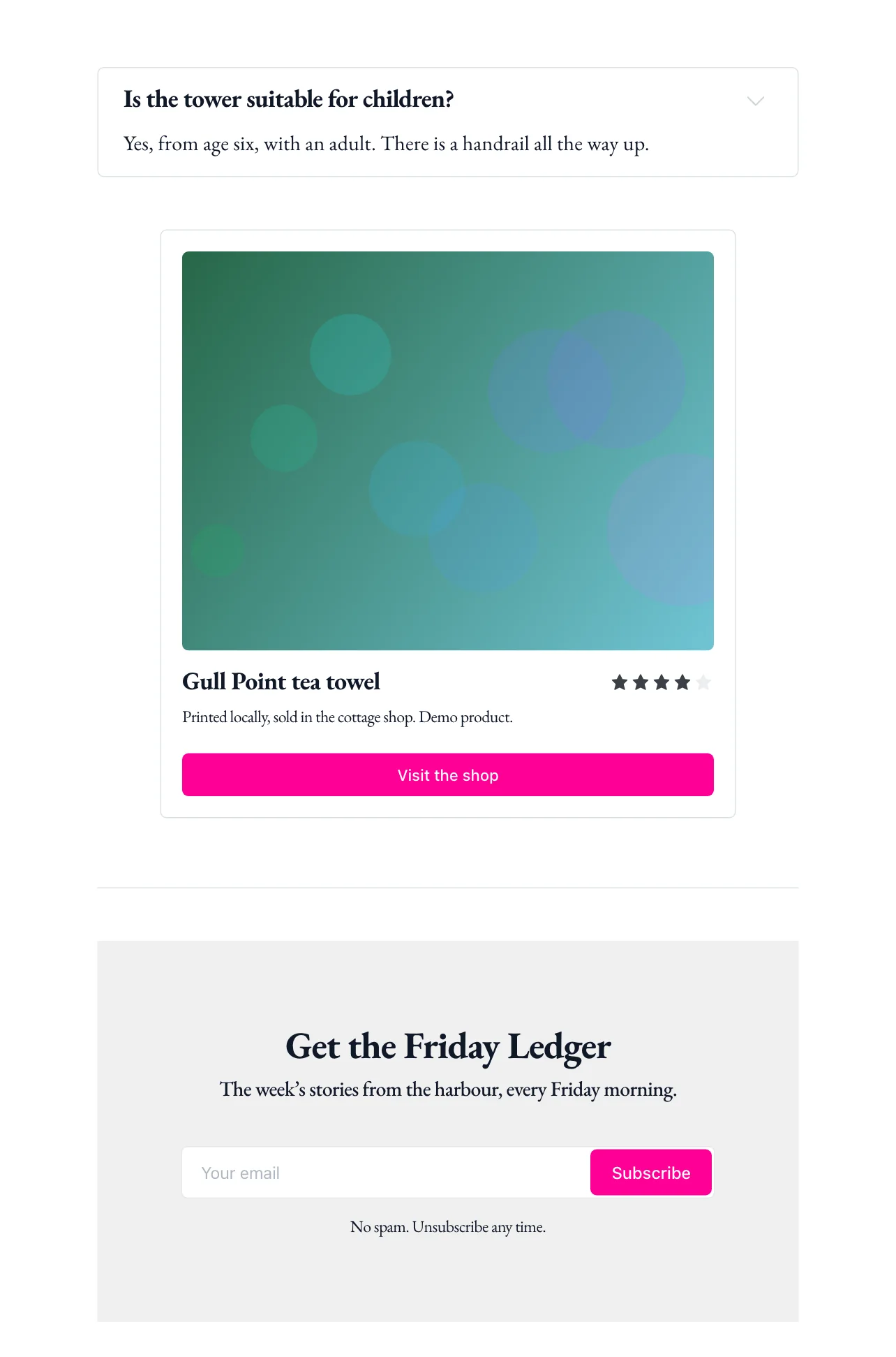
| Signup | A subscribe form with a heading, text and an optional background image. | /signup |
| Header | A large banner with a heading, subheading, button and background. | /header |
| Toggle | A question that opens to show the answer. Good for FAQs. | /toggle |
| Video | Upload a video file to play in the post. | /video |
| Audio | Upload an audio file, such as a podcast episode or a recording. | /audio |
| File | A file readers can download, such as a PDF. | /file |
| Product | A product or recommendation, with an image, star rating, description and button. | /product |
| HTML | Your own HTML, for an embed code or custom layout. | /html |
| Markdown | A block written in Markdown. | /md |
Below these, under Embeds, are cards for YouTube, Unsplash, X (formerly Twitter), Vimeo, CodePen, Spotify and SoundCloud, plus Other… for anything else that supports embedding. Paste the link and the card fetches the player or post for you. Pasting a link on its own line usually does the same thing.
How cards look to readers
In the editor, cards use a neutral style. On your site they take your theme’s fonts and your accent colour (set in Settings → Design & branding), so buttons and highlights match the rest of your publication.
Good to know
- A Signup card isn’t shown to readers who are already signed in, so members don’t get asked to subscribe twice. If your site doesn’t allow signups, the card has nothing to do.
- Email content cards and Public preview only matter for posts. On pages, the email options aren’t offered.
- Embeds load from the service they come from. If that service removes the video or post, the card on your site shows nothing.
- The HTML card shows your code as-is. Code that breaks the page layout can affect the whole post, so preview before you publish. For code on every page, use code injection.
- Want the same card in lots of posts? Save it as a snippet.
Last checked against the product on 7 November 2026.
Related
Still stuck?
Tell us what you were trying to do and what you saw, and we’ll help you sort it out.
Contact us